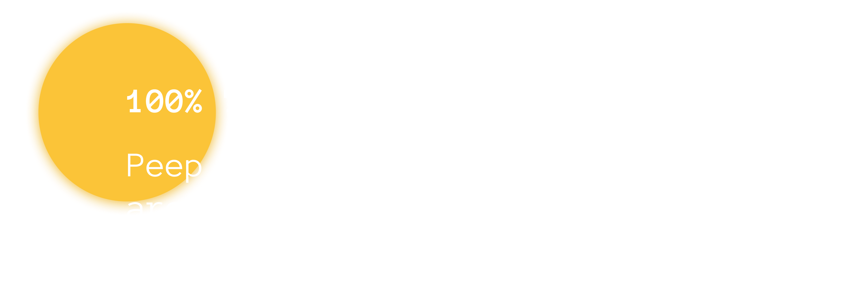
Peep
PRIVACY NOTICE CHROME EXTENSION
UX CASE STUDY — WINTER 2021
Duration
2 weeks
Tools + Techniques
Brand research, competitive analysis, rapid prototyping, wireframing, user testing
2 weeks
Tools + Techniques
Brand research, competitive analysis, rapid prototyping, wireframing, user testing
Overview
Online security with tangible rewards...
Peep is a privacy chrome extension that aims to educate and invigorate individuals to become more mindful of their online practices. Peep makes privacy easy and rewarding by providing just-in-time notifications and gamifying each action taken.
The Challenge
Legalese shouldn’t be the standard.
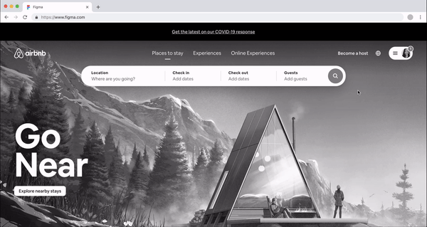
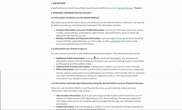
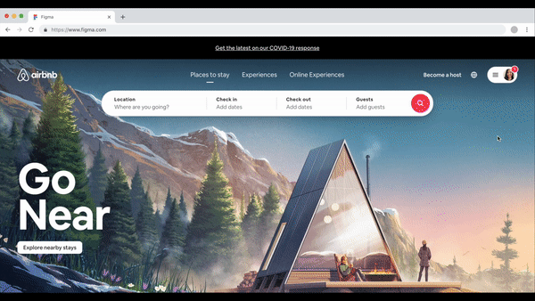
The wallpaper of this page is Airbnb’s privacy policy, nonrepeating yet even then. Their privacy policy happens to be one of the most incomprehensible and vague according to the Lexile test of text complexity based on sentence length and vocabulary.
👩🏻💻 Part I: User Research
👀 Part II: Current Privacy Space
😍 Part III: Competitive Analyses
💎 Part IV: Prototyping + Design
Why a Plugin
Current privacy extensions function passively in the background. Typically, only intermediate+ users understand the details.
Online security with tangible rewards...
Peep is a privacy chrome extension that aims to educate and invigorate individuals to become more mindful of their online practices. Peep makes privacy easy and rewarding by providing just-in-time notifications and gamifying each action taken.
The Challenge
Legalese shouldn’t be the standard.
The wallpaper of this page is Airbnb’s privacy policy, nonrepeating yet even then. Their privacy policy happens to be one of the most incomprehensible and vague according to the Lexile test of text complexity based on sentence length and vocabulary.
👩🏻💻 Part I: User Research
👀 Part II: Current Privacy Space
😍 Part III: Competitive Analyses
💎 Part IV: Prototyping + Design
Why a Plugin
How might we actively engage beginners to understand their online privacy behaviors and apply best security practices?
Current privacy extensions function passively in the background. Typically, only intermediate+ users understand the details.
High Level Goals
1. Implement concise, accurate, and readable lingo
2. Familiarize users with privacy controls to increase trust.
3. Educate and invigorate user to learn more about data privacy + data rights
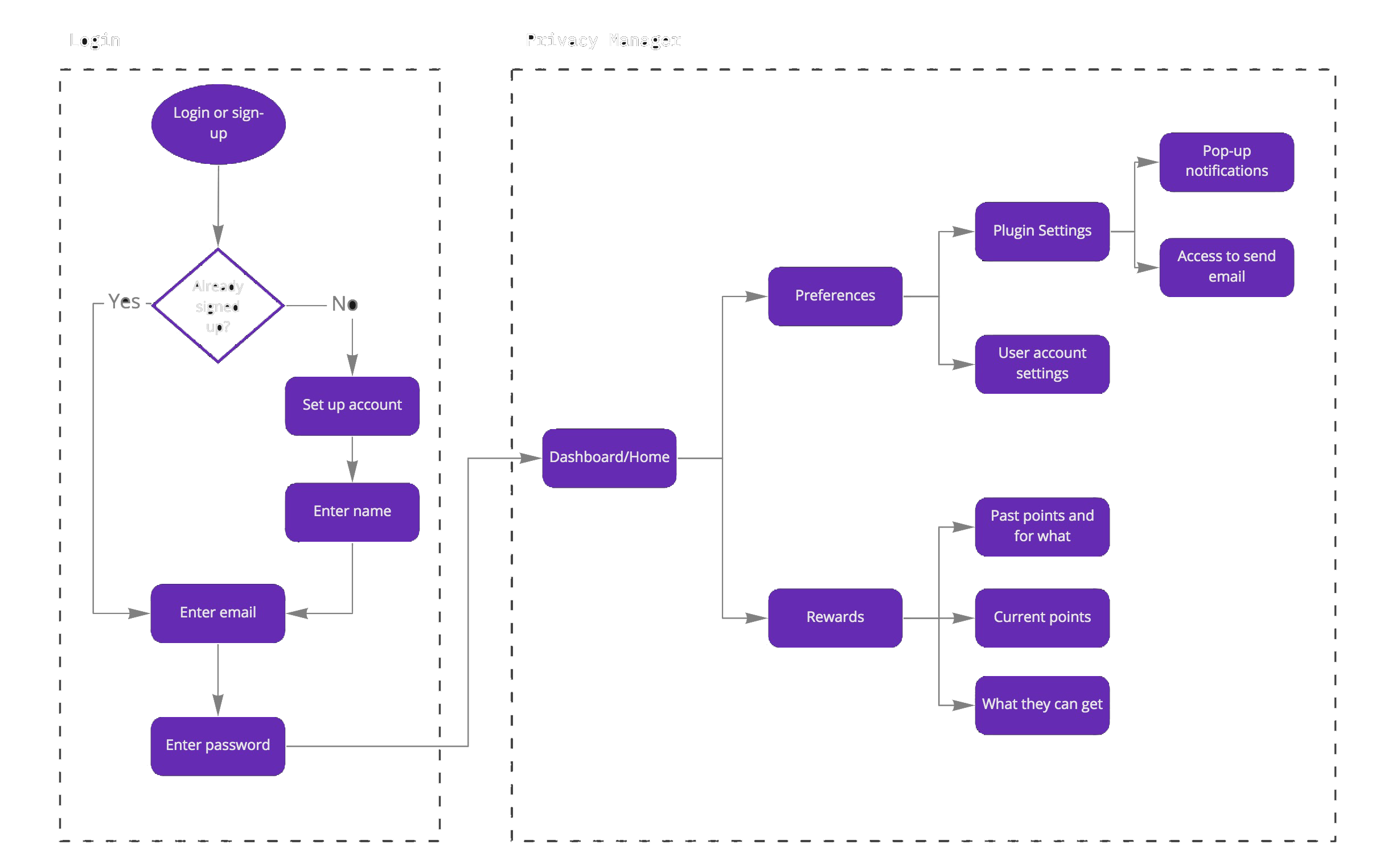
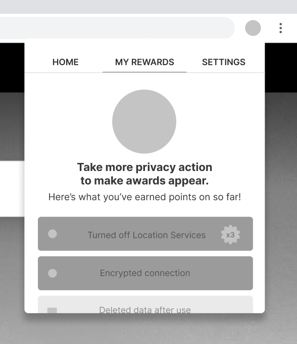
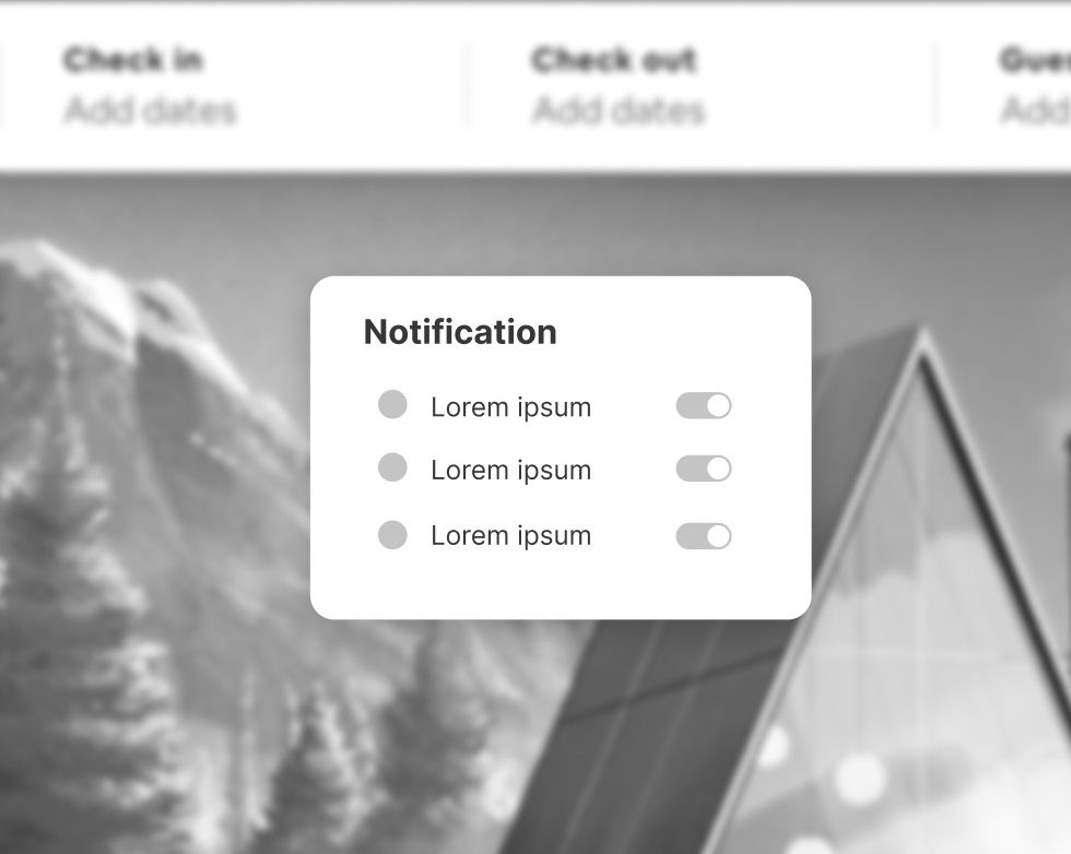
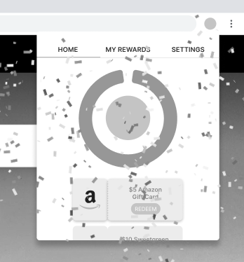
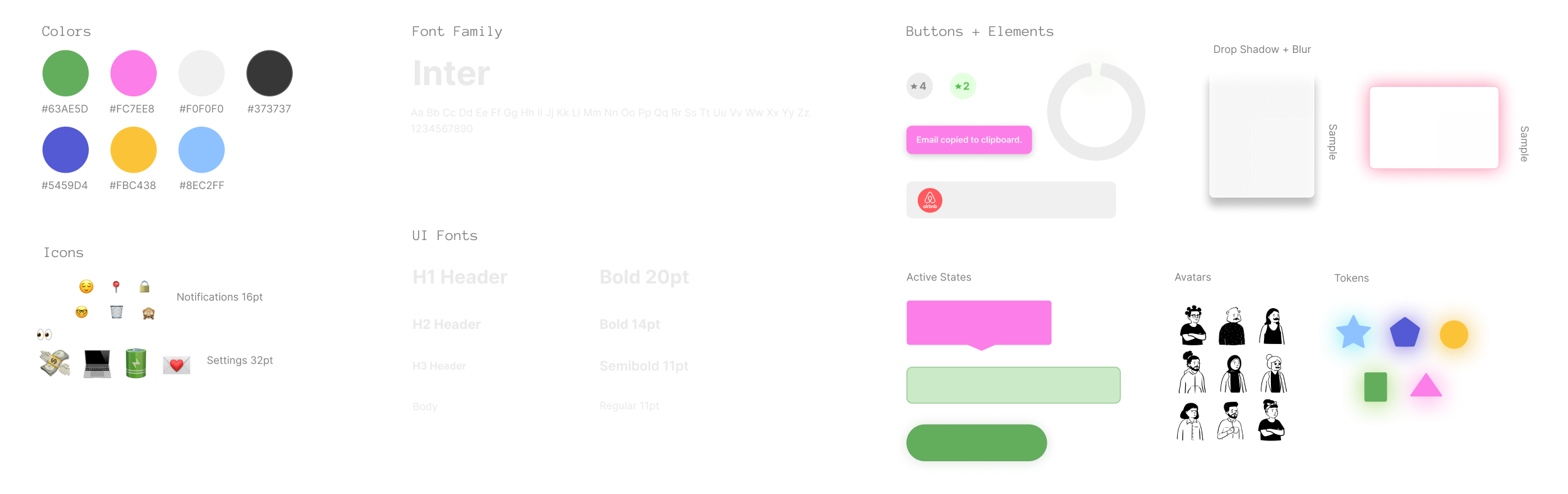
Design
Onboarding︎︎︎

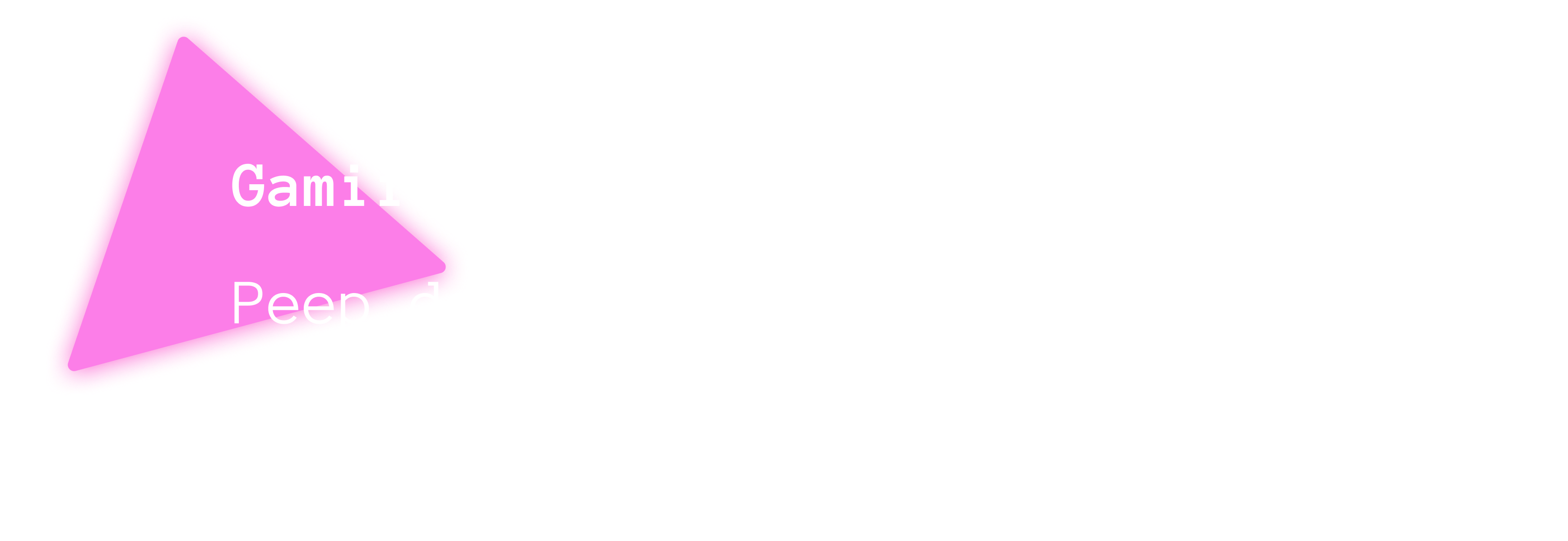
Gamification︎︎︎
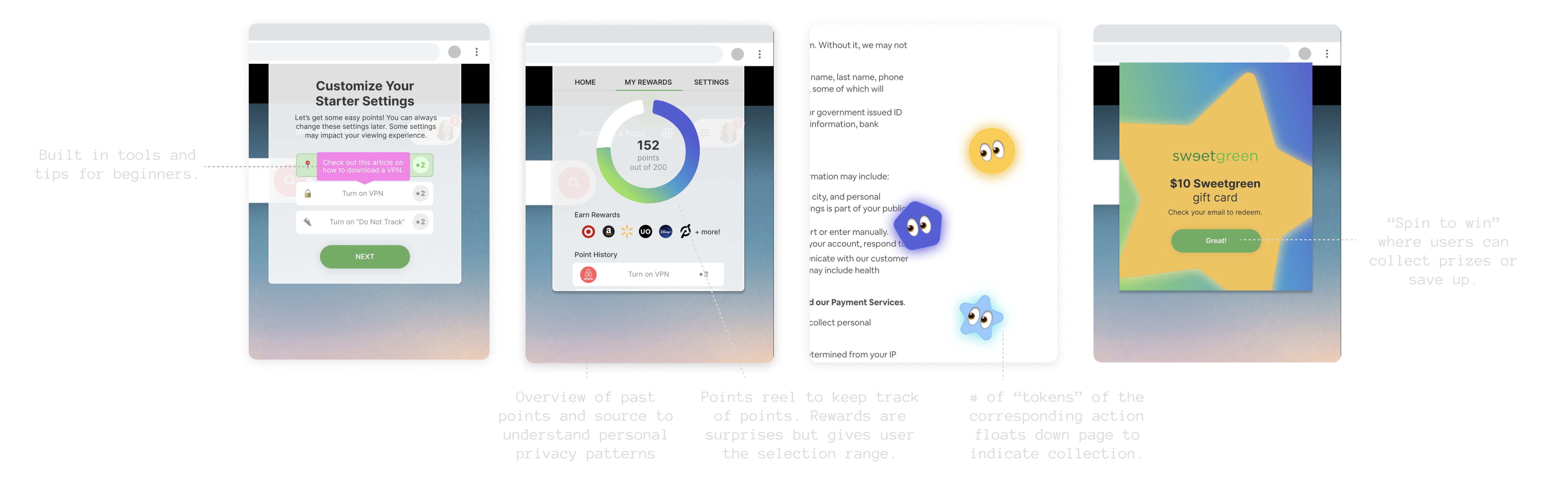
Notifications︎︎︎
![]()

Competitive Analysis︎︎︎
Metrics of Success︎︎︎
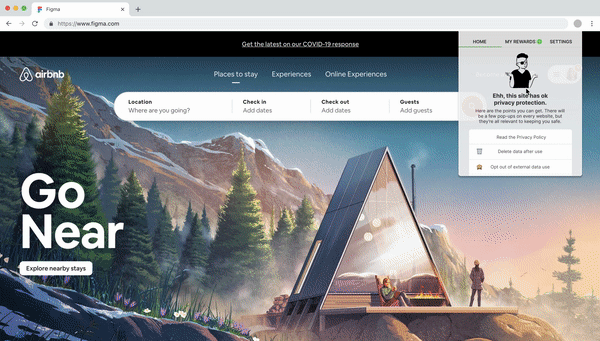
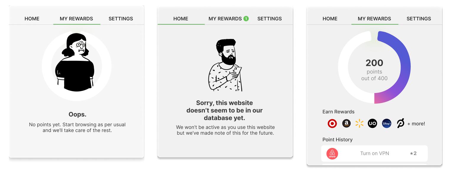
🔕 Notifications On
80% of users keep all notifications on in first month
👩🏻💻 User Retention
20% user retention within first 2 months
🌟 The Preferred Plugin
Peep is preferred among privacy beginners and intermediates. >7 net promoter score.
80% of users keep all notifications on in first month
👩🏻💻 User Retention
20% user retention within first 2 months
🌟 The Preferred Plugin
Peep is preferred among privacy beginners and intermediates. >7 net promoter score.
👩🏻💻 Part I: User Research
Do people actually care about privacy?
The privacy paradox: People will say they care about privacy but what they actually do does not align. I asked 10 friends, family members, and peers to take a likert scale survey about their privacy practices in context of their most used websites.
![]()
Do people actually care about privacy?
The privacy paradox: People will say they care about privacy but what they actually do does not align. I asked 10 friends, family members, and peers to take a likert scale survey about their privacy practices in context of their most used websites.

Key Takeaways
-
Privacy is not an active priority, but a passive one.
The primary goal is to complete the task they’ve set out to do whether shopping for clothes or booking a hotel. How can this experience push privacy up a tier or two within the priority hierarchy?
People choose platforms based on their close circles or societal norms.
Many people who use Facebook know that FB has poor data practices based on recent news articles but they still depend on the platform to connect with their friends/family. How can this design provide a sense of choice and equivalent options?
Short-term benefits > Long-term impact.
I just want to know what type of bread I would be, take what data you want from me! How can this design get people to care about the full scope of pros and cons over time?
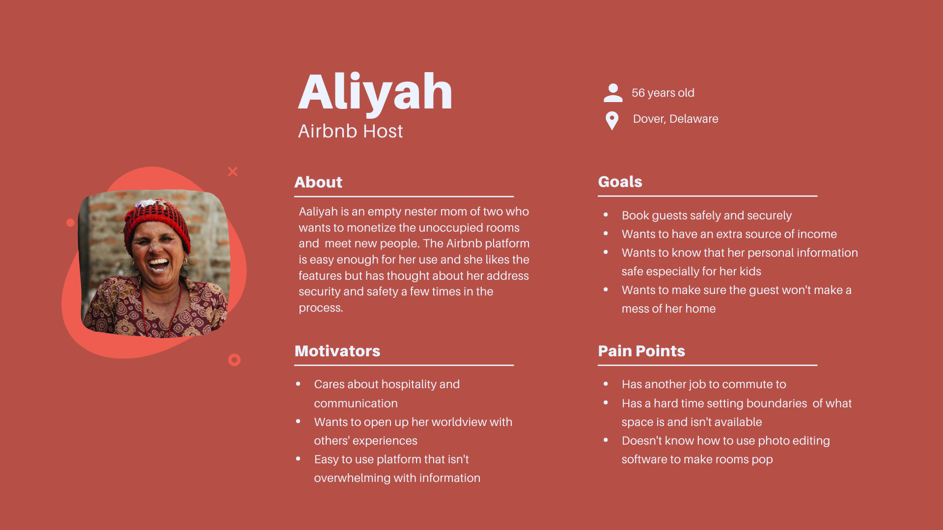
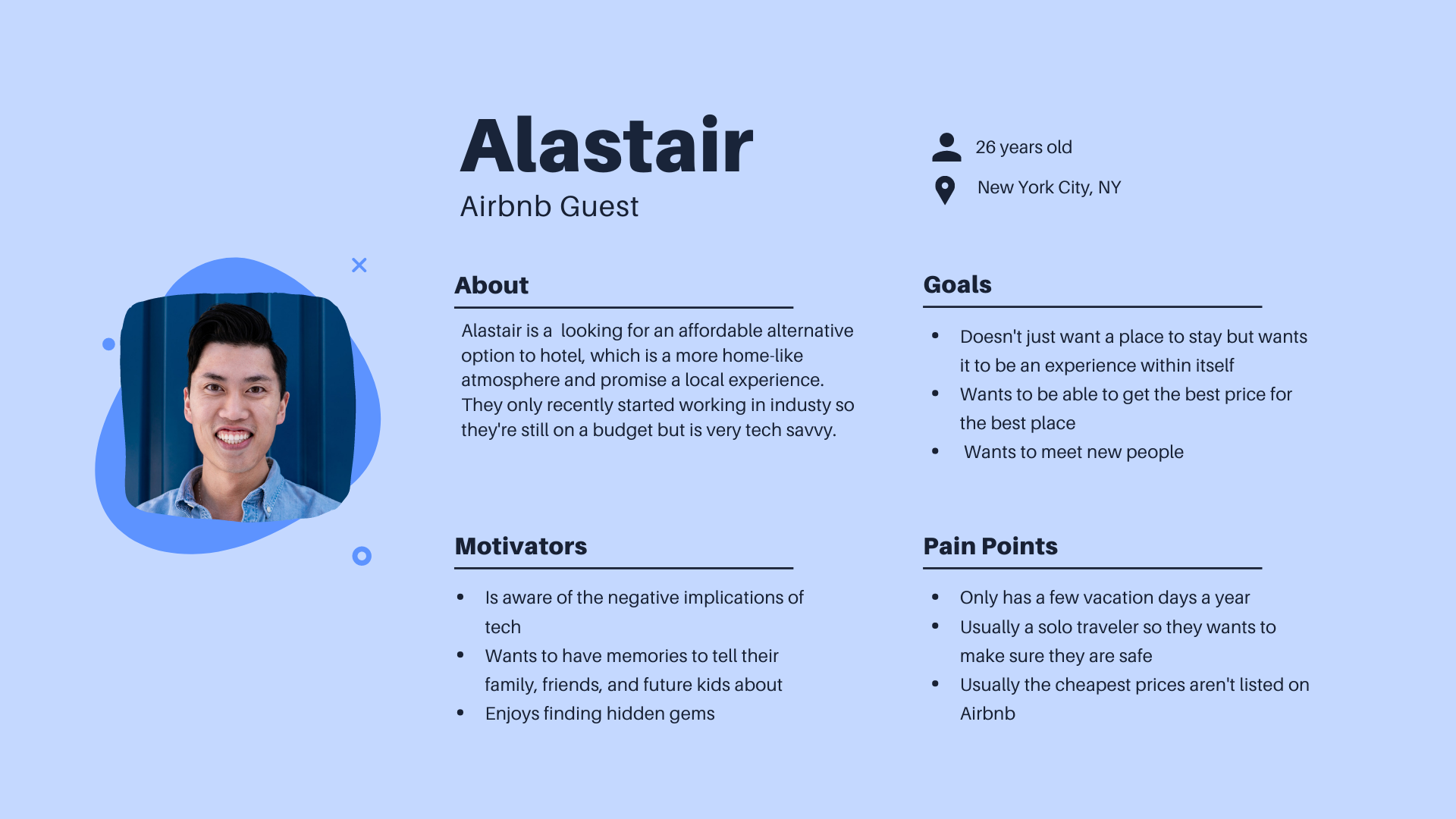
Personas
👀 Part II: Current Privacy Space
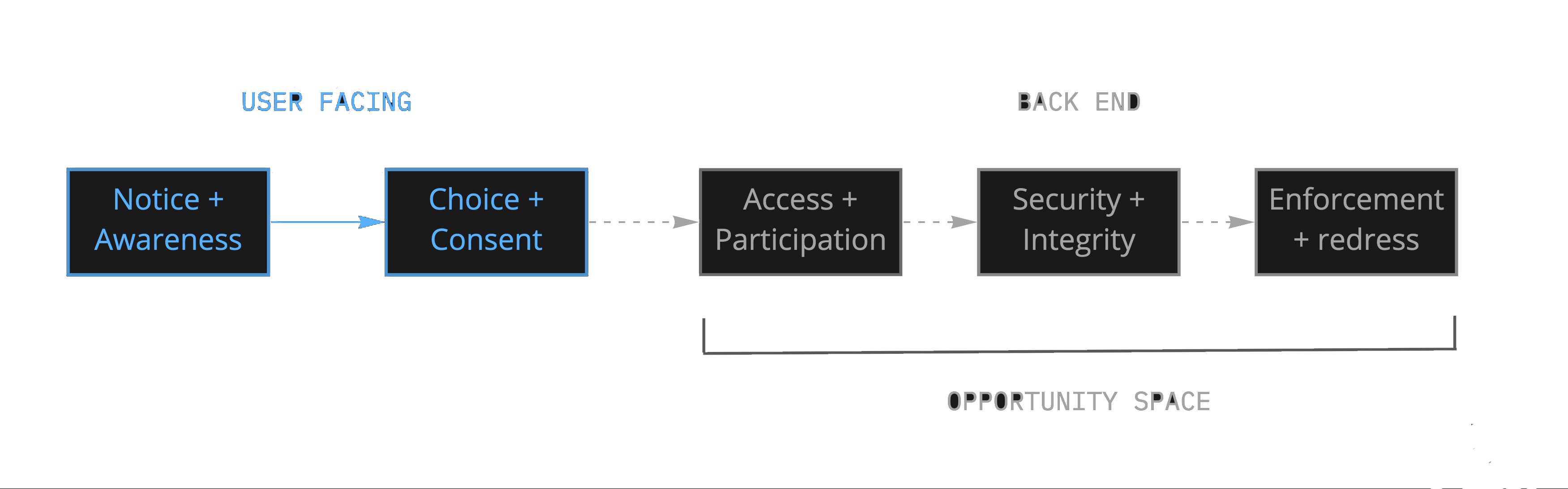
Companies are not incentivized to implement a usable privacy policy.
Current privacy notice patterns can be portrayed with a system development process with primary dimensions in:
- Timing (when information is provided)
- Channel (how it’s delivered)
- Modality (what interaction modes are used)
- Control (how choices are provided)

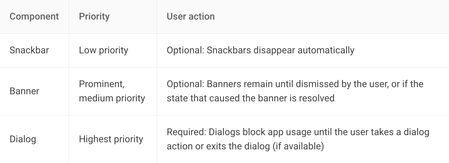
Types of Notifications
Website/Social Media Privacy Notices
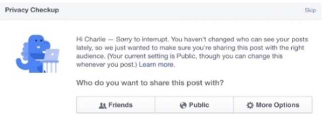
- Uses a settings manager with on demand timing that provides users visual and decoupled control
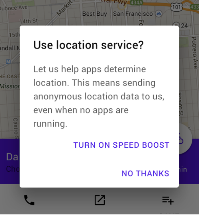
Smartphone App Permissions

- Uses a blocking method where users must allow or deny persistent visual permissions that show up on demand and at set-up.
Photo/Video Logging

- Uses haptic, visual, and auditory notifications where you have to also use an external settings manager. Unique due to bystanders as user.
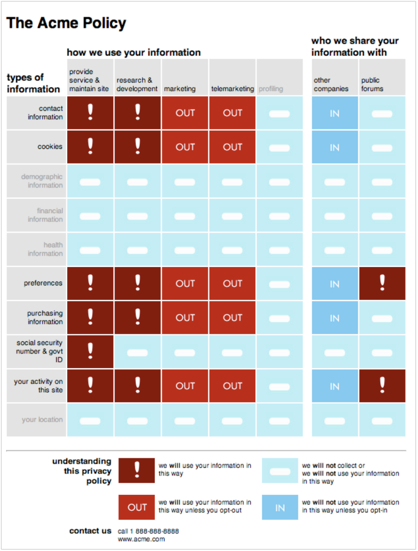
Trending: The Nutritional Label
This concept replaces the the long-winded text but isn’t widely implemented

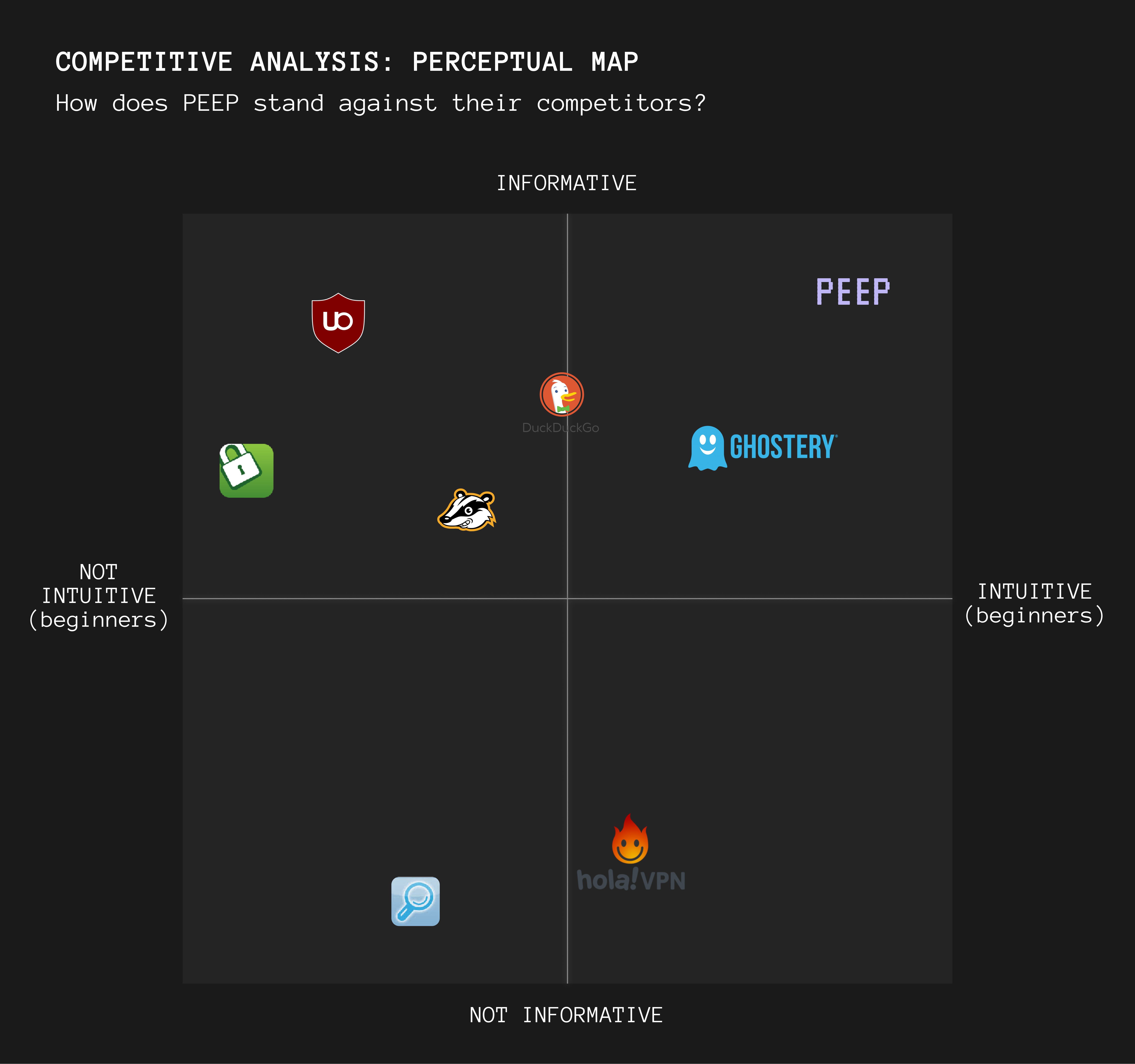
😍 Part III: Competitive Analysis
I mapped a wide variety of patterns to see how specific interactions serve the needs of the user both on current extensions and mobile.
What UX patterns are out there?
I mapped a wide variety of patterns to see how specific interactions serve the needs of the user both on current extensions and mobile.
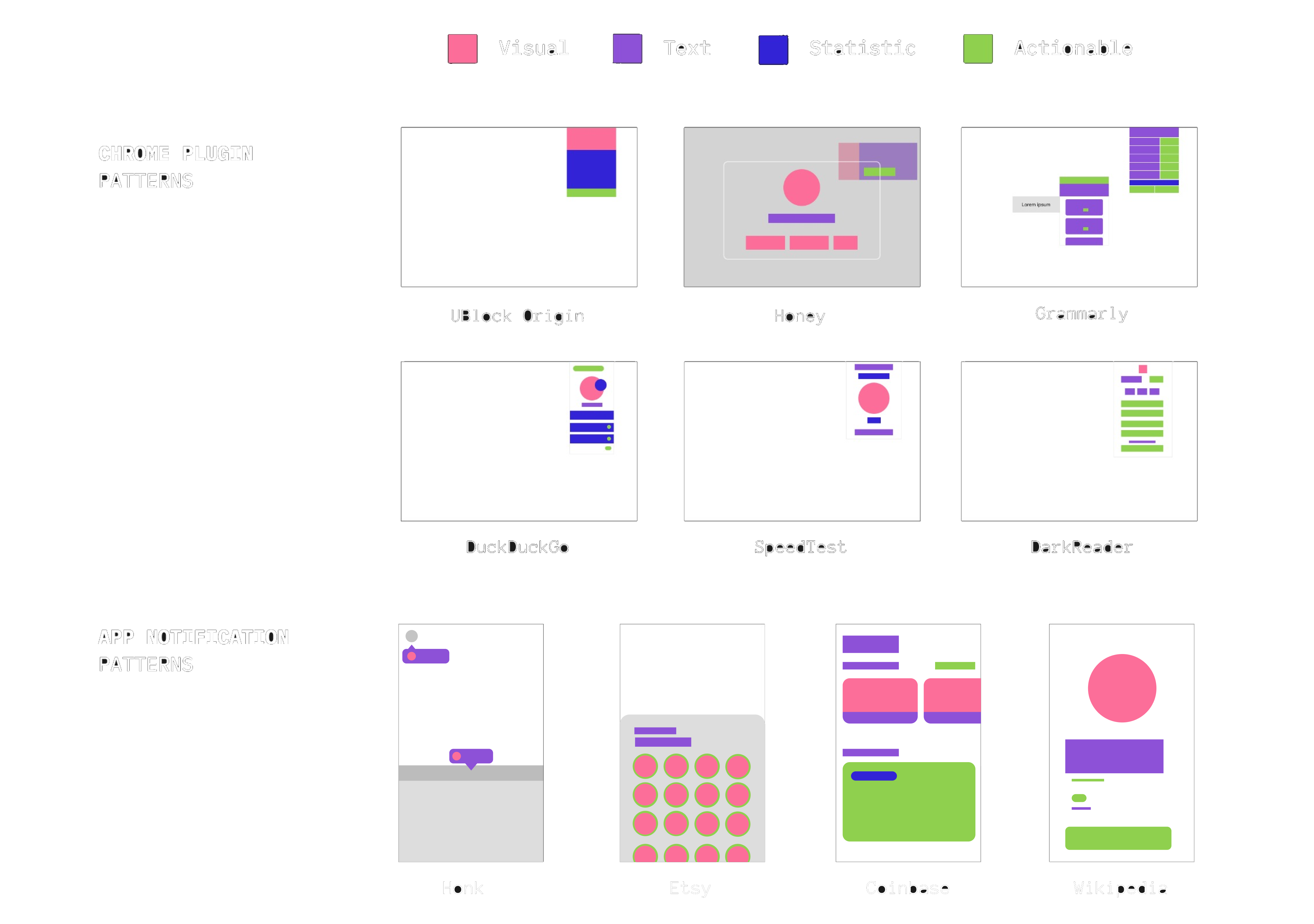
User Flow Patterns
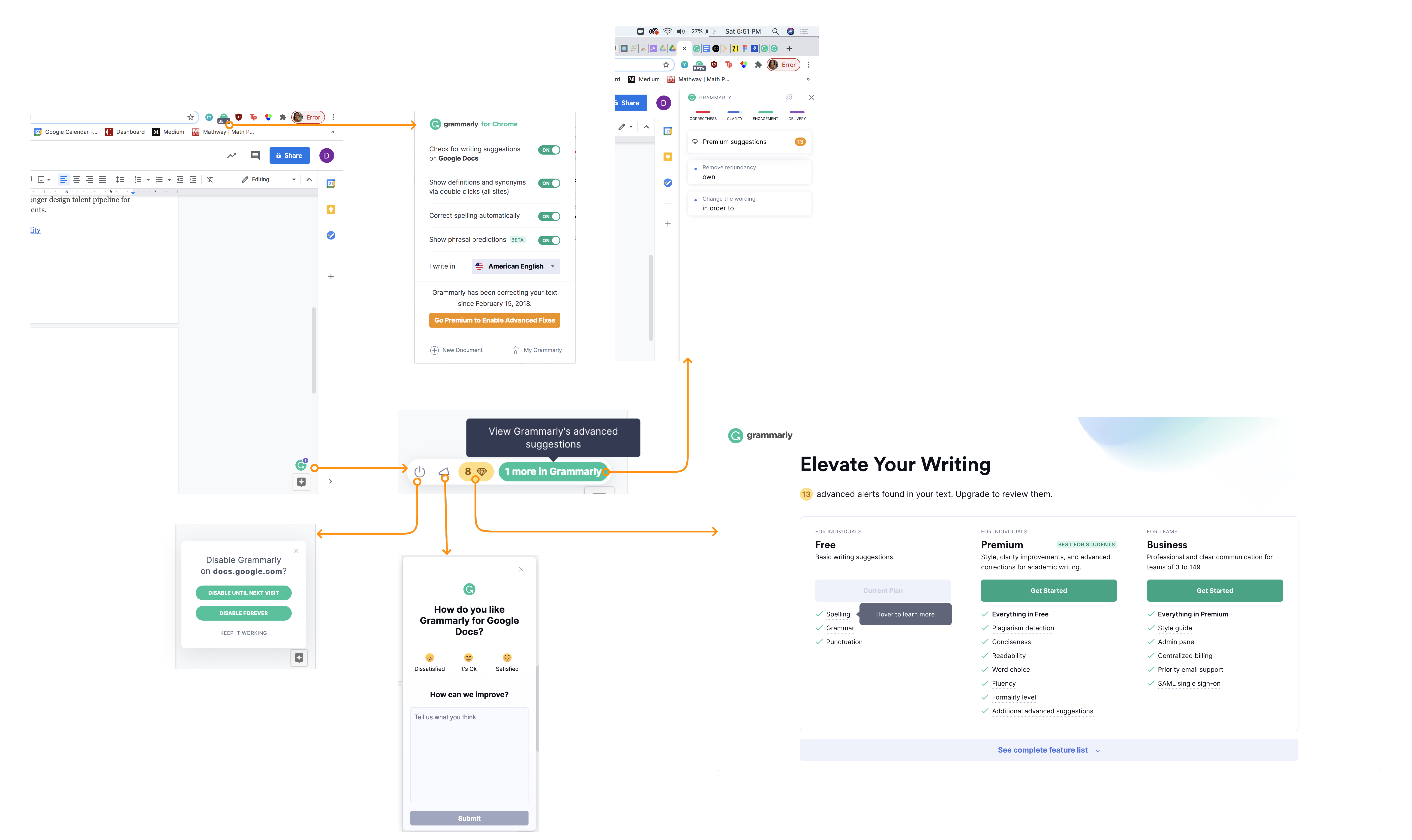
Grammarly: Chaotic flow with multiple entry, interaction, endpoints.
Icons are mostly clear but it can be difficult to recall each interaction as some lead to an external page whereas others lead to popups on various locations on the screen.

DuckDuckGo: Stationary + straightforward user flow.
Prioritizes displaying information rather than having multiple interactions. One external link and most are bullet points. Icon of plugin changes to reflect the state of the site which is nice so users don’t have to keep clicking into the plugin to see information.
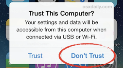
UX Consent Patterns
How to gain consent explicitly
There are many overlaps from the privacy consent space and the design space. It’s important to ensure that the notifications in this plugin are compliant in achieving explicity consent non-intrusively.
How to gain consent explicitly
There are many overlaps from the privacy consent space and the design space. It’s important to ensure that the notifications in this plugin are compliant in achieving explicity consent non-intrusively.

IAPP’s Guide to User Consent
⛔️ Promoted choice is effectively just a default.
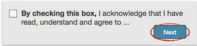
⛔️ With the button is enabled, people are less likely to read the information
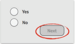
✅ Grayed out buttons signal the user to pause, decide, then proceed
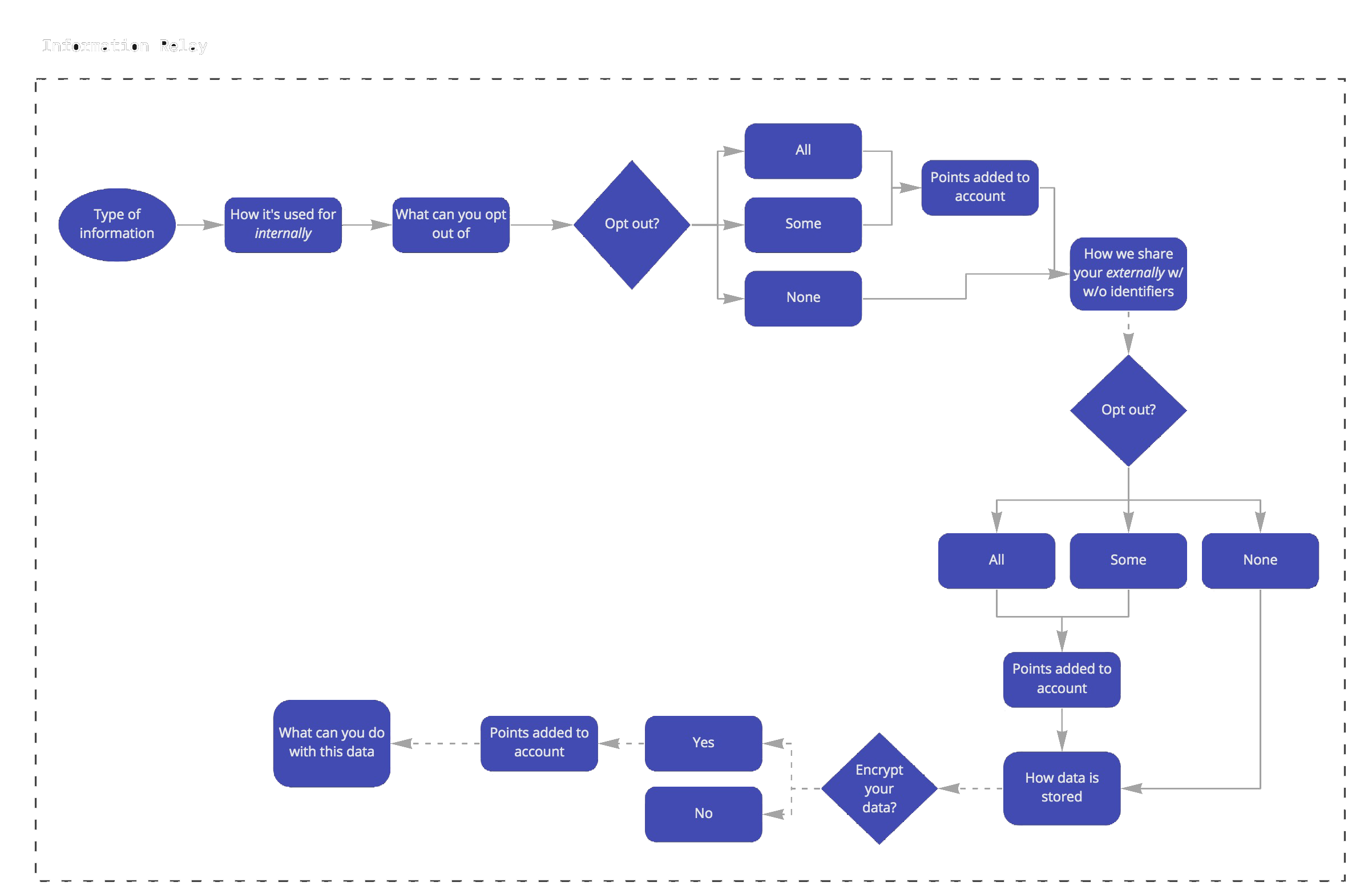
💎 Part IV: Prototyping + Design
It was important to categorize the components of the privacy notice to ensure that users are understanding all aspects of the privacy policy beyond the front-facing information.
Mapping out the infrastructure
It was important to categorize the components of the privacy notice to ensure that users are understanding all aspects of the privacy policy beyond the front-facing information.
Midfi Wireframes
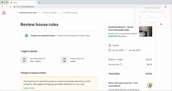
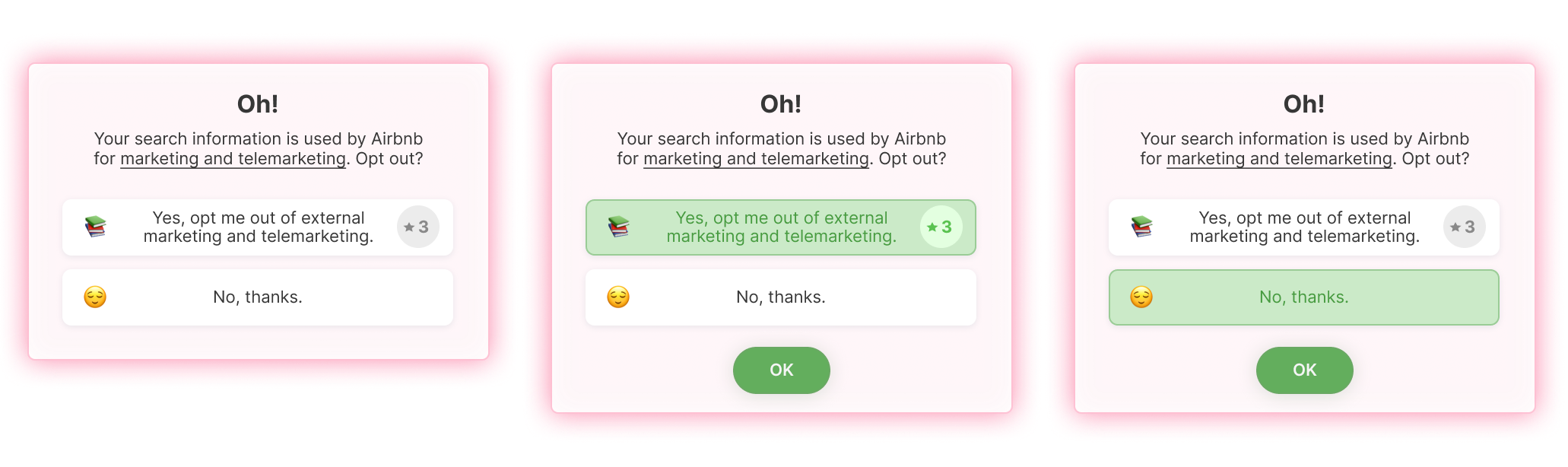
Some notification types look and feel too disruptive when casually browsing.
While the goal is to bring the user from a passive to active state, some users were irritated by the disruption and would have to pause to recall the action they were doing previously.
Some notification types look and feel too disruptive when casually browsing.
While the goal is to bring the user from a passive to active state, some users were irritated by the disruption and would have to pause to recall the action they were doing previously.

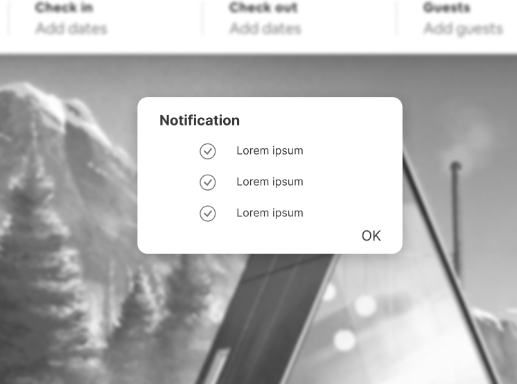
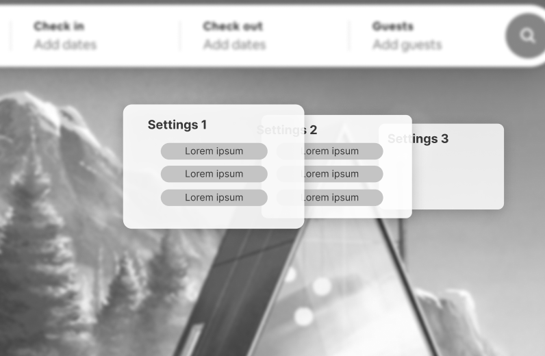
Based on this initial feedback, I created a more predictable and stagnant layout to test, leaving the variability in the frequency and point collection.

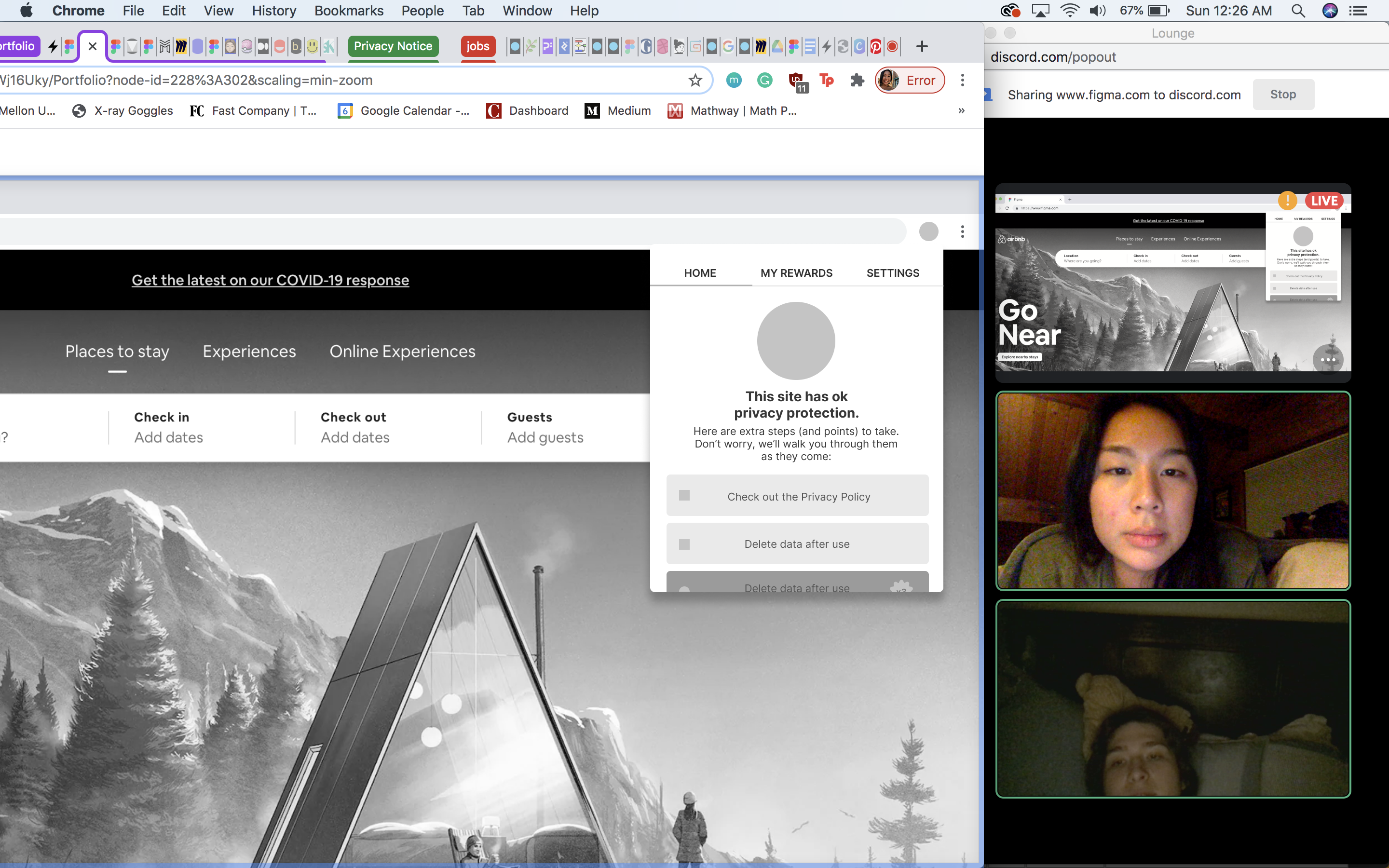
Usability Testing
Discord Think Aloud
Task 1: Ask user to customize their account settings
Task 2: Ask user to make a booking
Task 3: Ask user to look through privacy policy
Task 4: Ask user to delete their data
Task 5: Ask user to redeem their rewards
Task 6: Ask user to view their available points checklist
Insights
- Most users wanted to see the scope of what privacy steps are available could get and their points
- Some used wanted the delete data option to just result in “copied to clipboard” rather than immediately opening the email app
- Most users wanted to be able to choose their own gift card or have it be a surprise from a list of options
- Most users didn’t mind the notifications interrupting their purchasing/booking flow because it’s the way of learning
- The gamification was enjoyable and allowed users to learn more compared to their usual privacy plugin
Final Features & Impact︎︎︎


Metrics of Success
- 80% of users keep all notifications on within first month of use
- 20% retention of users within first 2 months
- Peep is the preferred plugin among privacy beginners and intermediate users (>7 net promoter score)
Key Takeaways
- Don’t get too attached to any particular design (sometimes, it just doesn’t translate for users) 😳️
- But don’t be afraid to defend your ideas 🥵️
- Explore by making not just thinking 🛠️